CLIENT
DAWN Canada
SERVICES
Branding
Website
DAWN Canada stands for the Disabled Women’s Network of Canada. DAWN Canada is an intersectional feminist human rights organization that works to address systems of oppression.
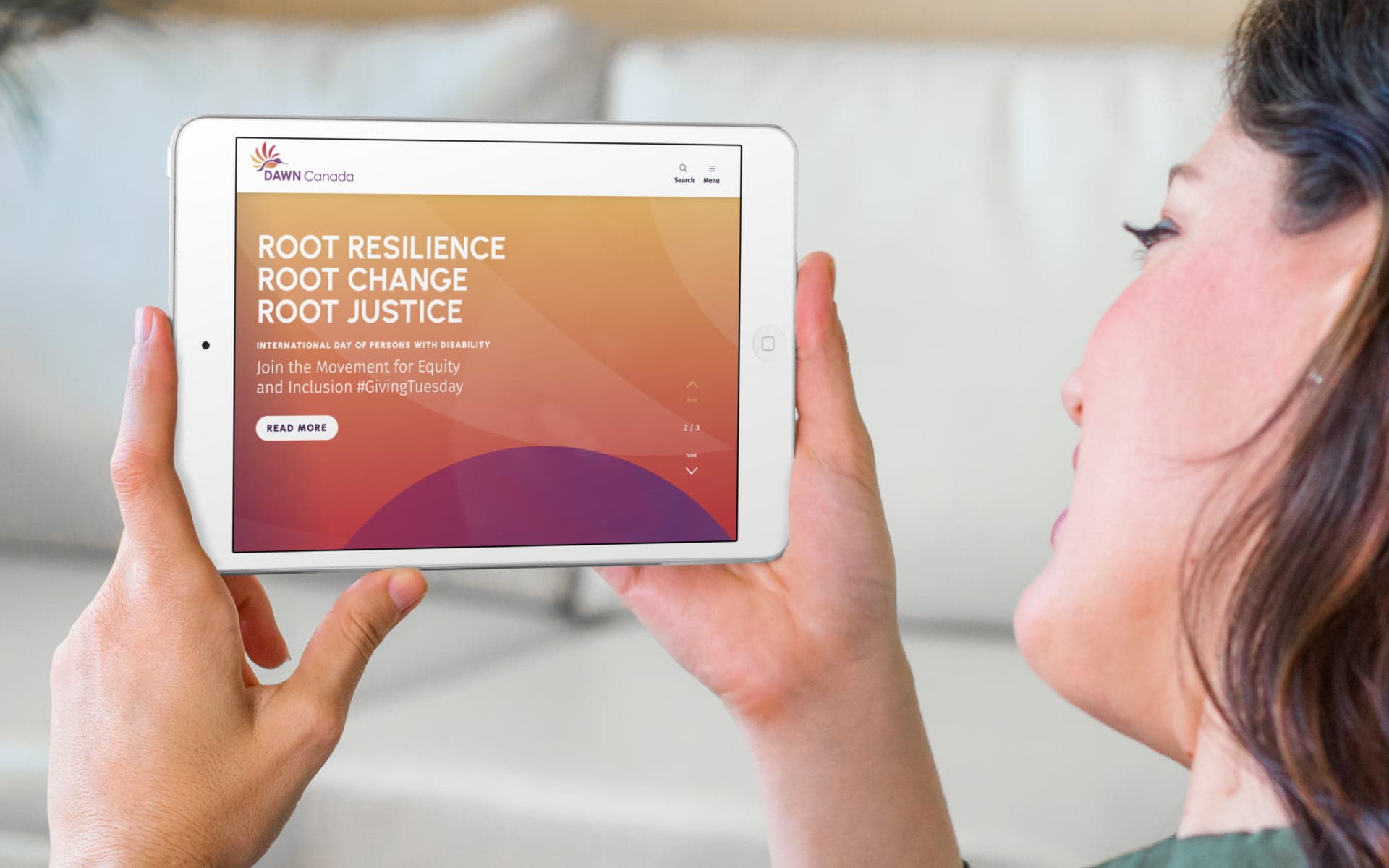
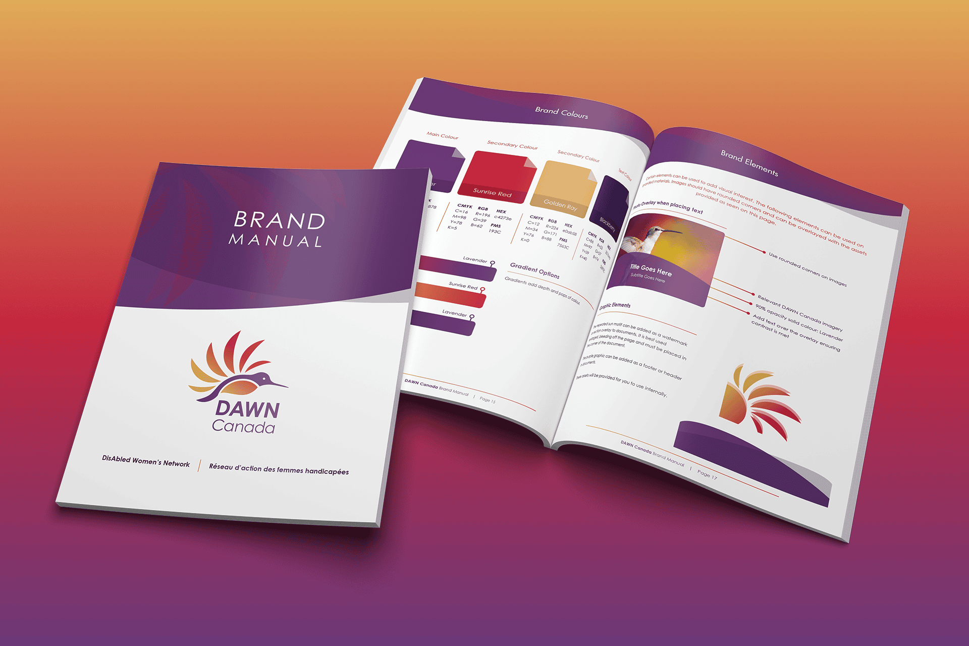
We created a new brand identity for DAWN Canada in 2020. In 2024, we embarked on a redesign of their website to reflect their new branding and implement a content management system that would allow their team to upload, organize and showcase their work effectively and accessibly.


How we helped
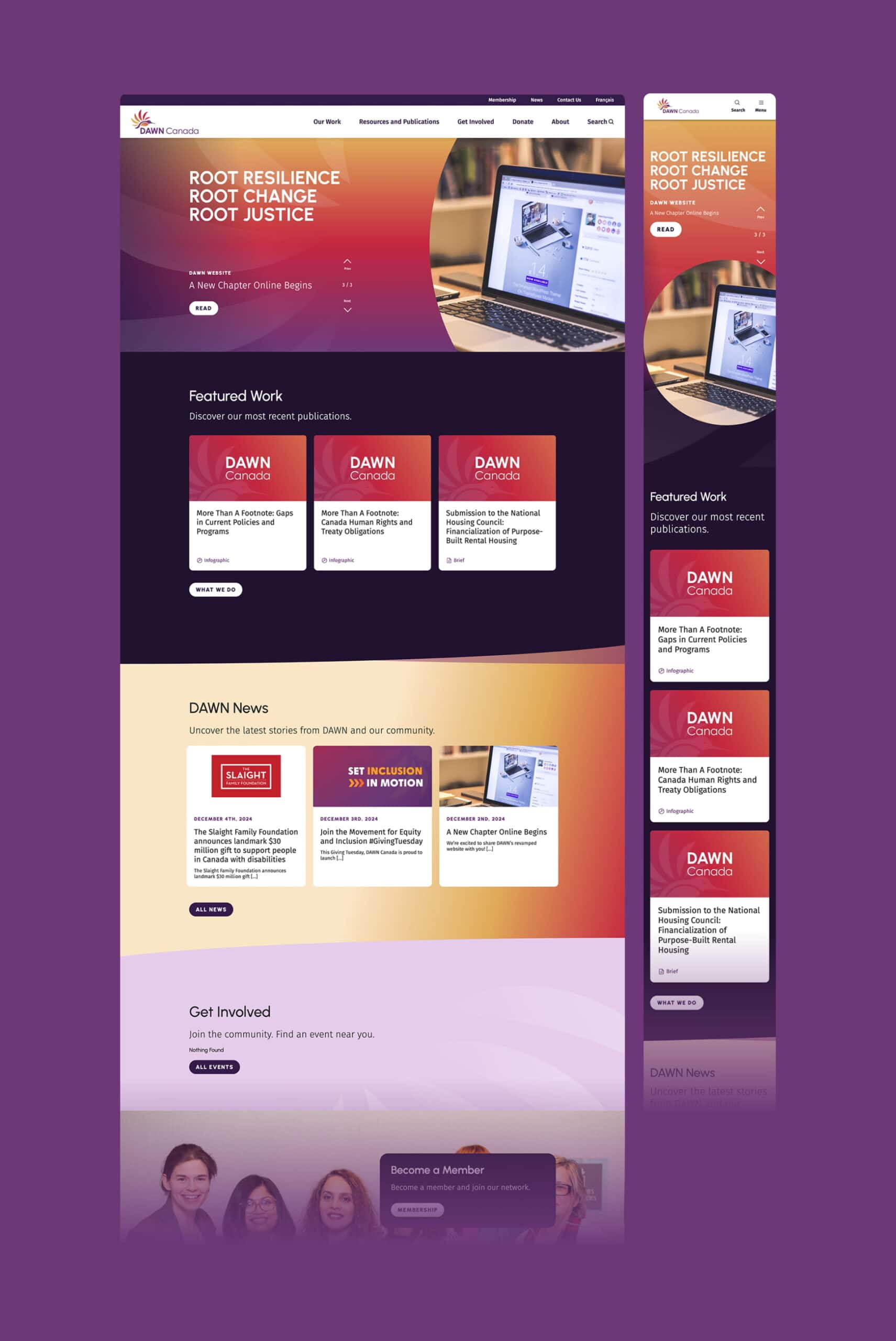
After thoroughly reviewing their existing site and content, we proposed a rationalized information architecture that put their valuable resources front and centre. Projects, publications, and news now use consistent page layouts and metadata fields that make it much easier for the client to upload and organize resources.
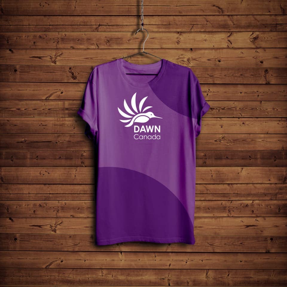
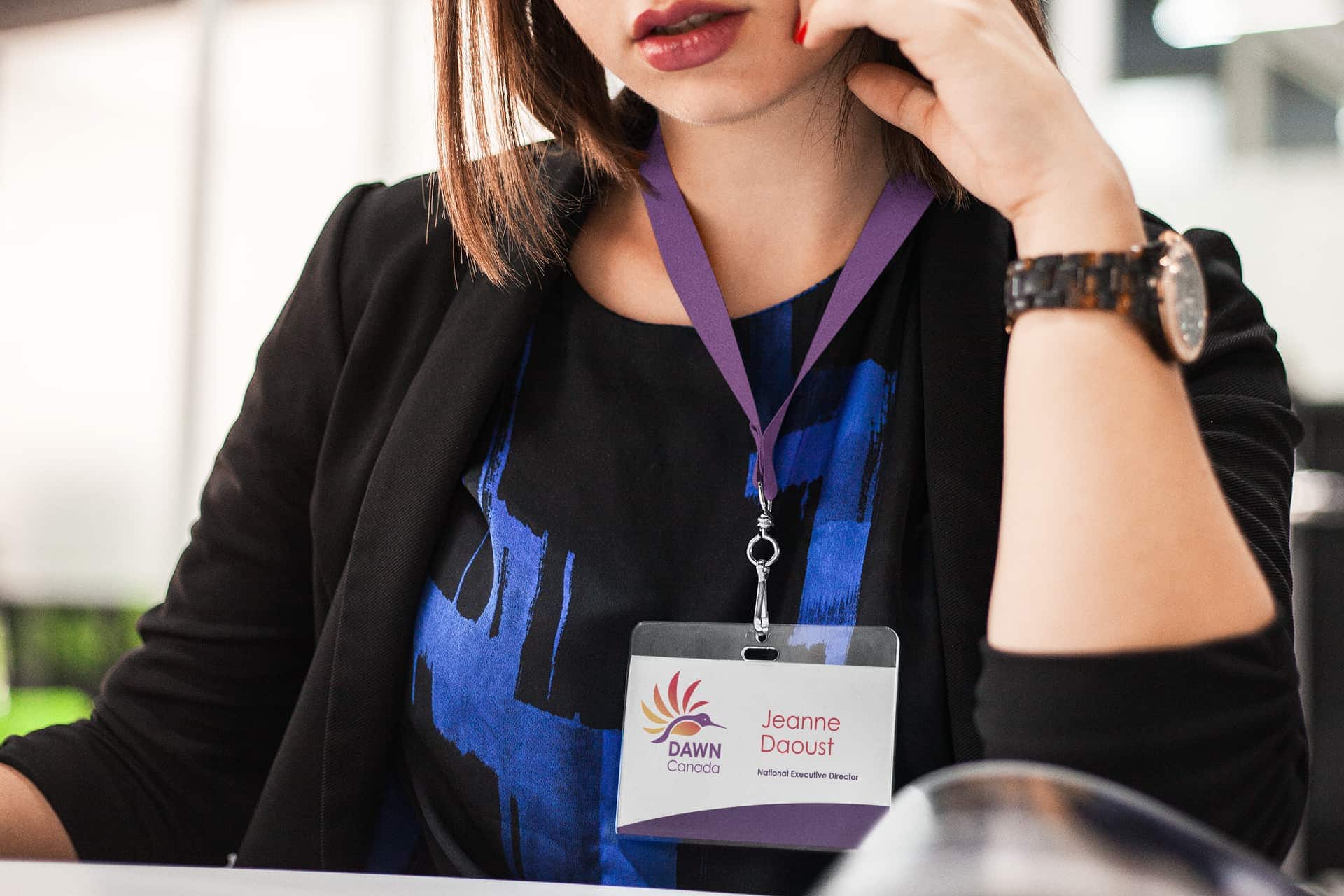
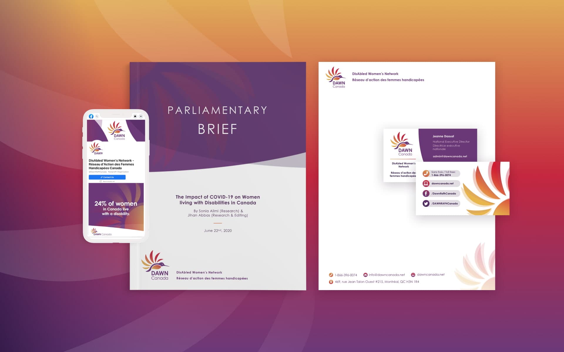
DAWN Canada’s branding evokes the sun rising over a new day, and we incorporated this imagery throughout the site’s design. Backgrounds of purple-red-gold gradients and sun rays give the website a distinctly warm and welcoming character.


Making a difference
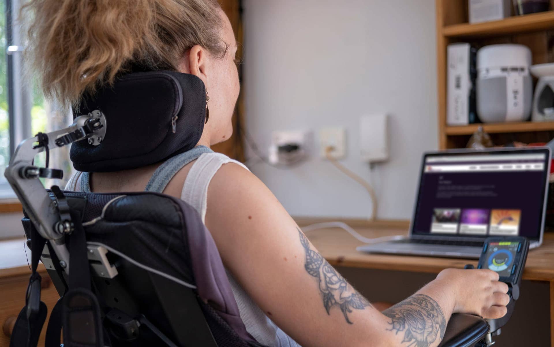
We also carefully considered how the content and design would impact DAWN Canada’s primary audience of women with disabilities, a vast community whose needs are all different. The new site is optimized not only for folks with visual disabilities, but also for often-overlooked audiences with motor, vestibular, neurological, and intellectual disabilities. Some of the many accessibility features include legible type, adequate contrast, employing motion subtly and only where useful, and simplifying language whenever possible.
Creating connections
The redesigned website supports DAWN Canada’s mission to break down barriers and end the poverty, isolation, discrimination and violence experienced by women and gender-diverse people with disabilities. Our logo won an Award of Excellence for Best Logo Redesign at the 12th Worldwide Logo Design Annual (2022). We’re pleased to see how this branding resonates with a broader audience.
