CLIENT
E-Alliance
SERVICES
Branding
Illustration
Web design
Development
Social media assets
Supporting Sports for everyone with the E-Alliance hub for gender and equity in sports.
Across Canada, women are underrepresented in sports of all sorts. But a team of researchers from three universities wants to even the playing field. Scientists from University of Toronto, Université de Laval, and Guelph University banded together to go for a big goal: gender diversity and equity in sports. They just needed the right brand coach.
How we helped
As a team of three female designers actively involved in sports, we were an ideal match. To kick things off, we led a strategic session to put together a game plan for the organization—and brainstorm a name fans could get behind. We soon honed in on the E-Alliance, which was inspired by their motto: Equity for All.
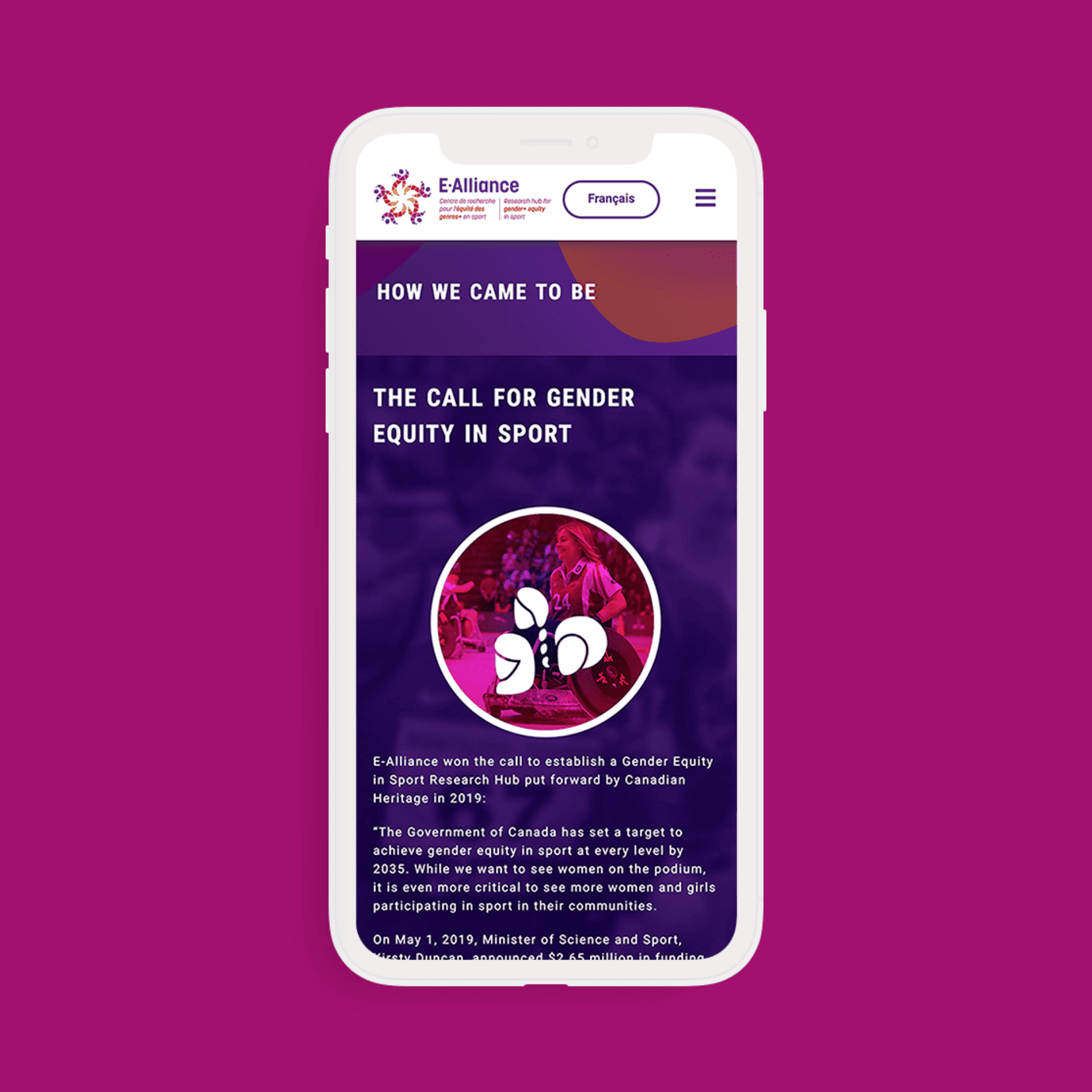
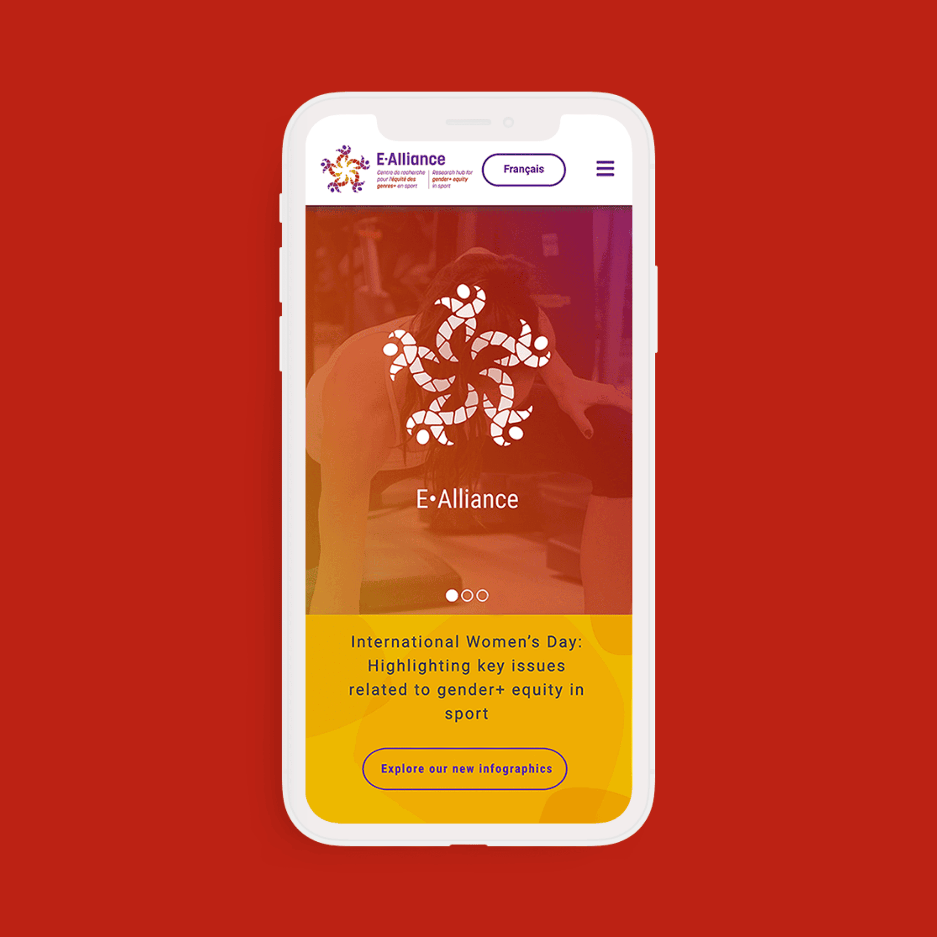
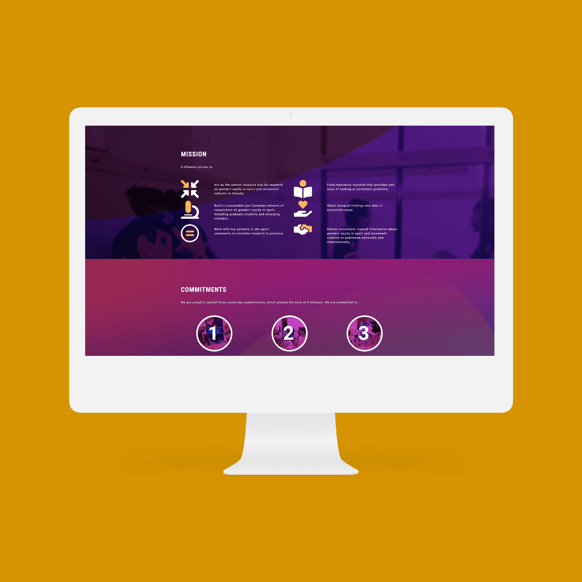
Next up, we tackled an ambitious project scope. This included designing diverse, bilingual branding, print materials, and a custom website to help them pitch their research in a way that was easy to both write and read.
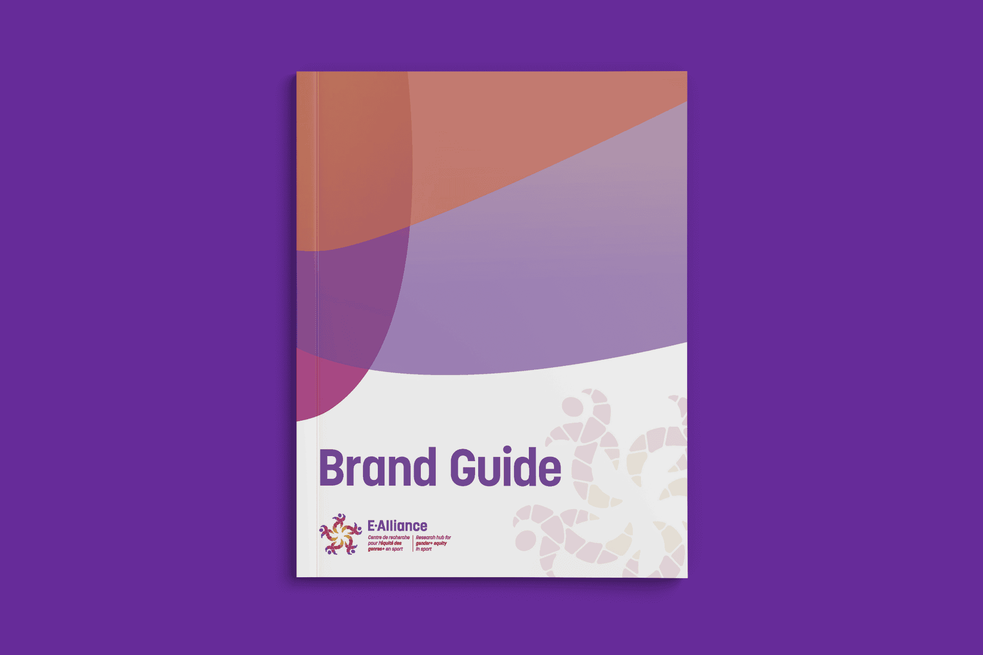
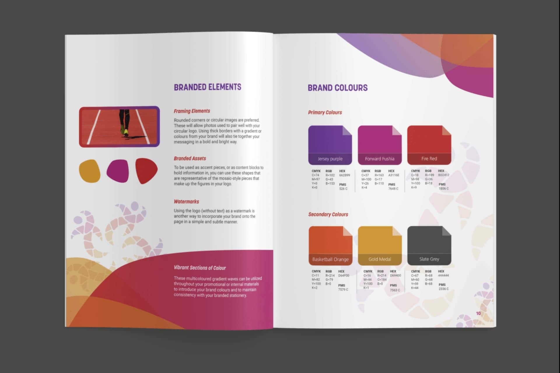
The E-Alliance team was so pleased with their new branding that they created a highlight reel that featured our team. They continue to use our branding assets and social templates to share posts and other research about gender inequalities in sports. And not only is their website fully accessible, it’s also full of research that’s easy to sort by topic or author. It’s a win all around.

This women-led and Indigenously owned studio was an excellent fit. We couldn’t be happier with the design they created!
E-Alliance team
Unfortunately the program funding for this project has ended. We’re deeply proud of the work accomplished with the E-Alliance team and the efforts that they have put forward to creating more equity in sports.
