CLIENT

Ontario First Nations Technical Services Corporation

SERVICES

Branding
Illustration
Print Collateral
Digital Assets
Motion Graphics
Video

The OFNTSC are on a mission to help First Nations in Ontario build technical self-reliance and self-sufficiency.

To that end, they advise more than 133 groups on many types of services, such as housing, electricity, water, and safety. Now, they wanted to rebuild their own brand to connect even more closely with their communities and share important information quickly.

How we helped

Together, we created a new brand guide and assets that could reach across all the ways they communicate, from their social feeds to their presentations to the decals on their vehicles. Their colourful new brand represents diverse Indigenous cultures and aligns to their top message—safety.
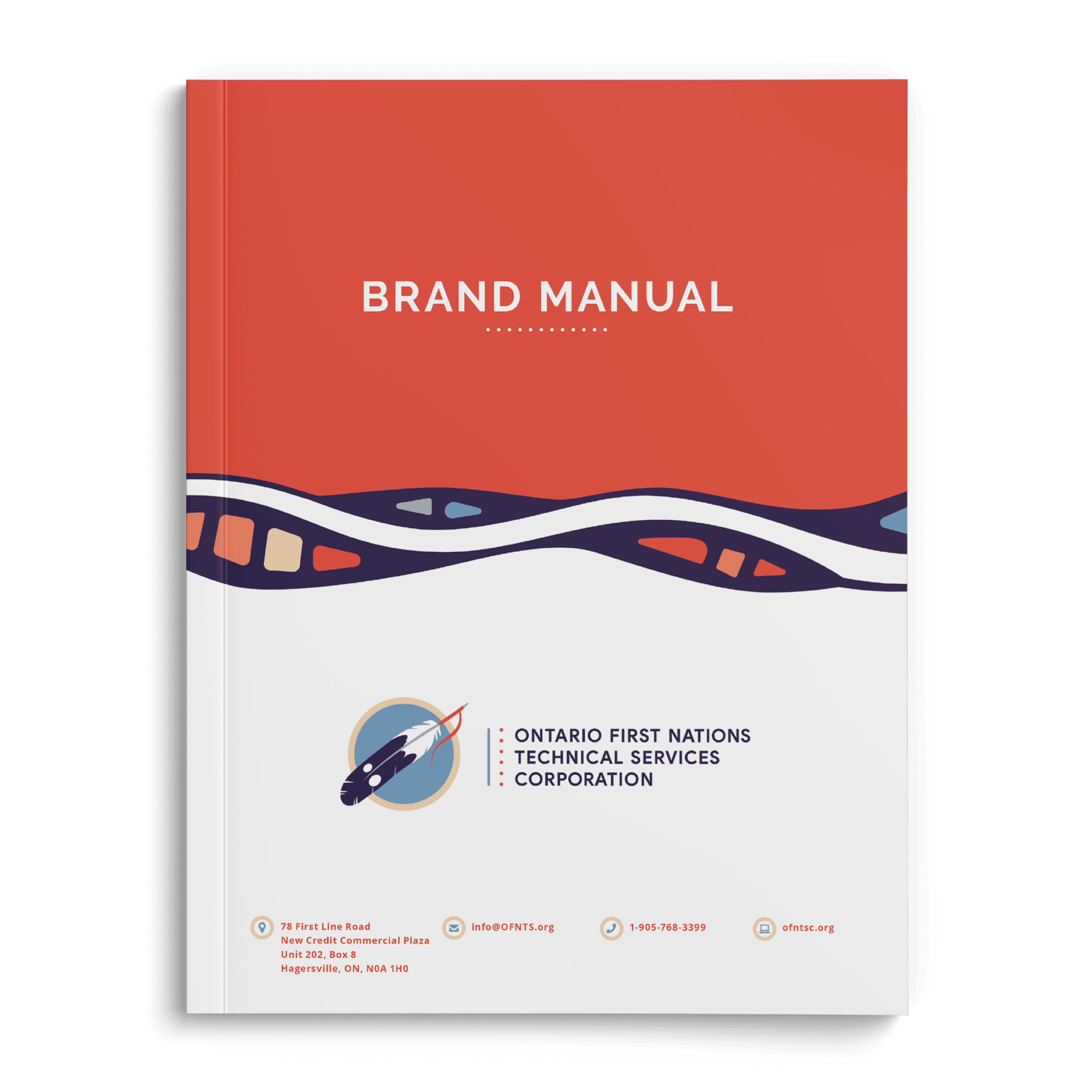
The cover of the Ontario First Nations Technical Services Corporation Brand manual. The cover is half orange, half white, separated by deep purple, wavy lines that contain sections of orange and blue within them. The top reads Brand Manual and the bottom reads Ontario First Nations Technical Services Corporation with their logo to the left of the text.
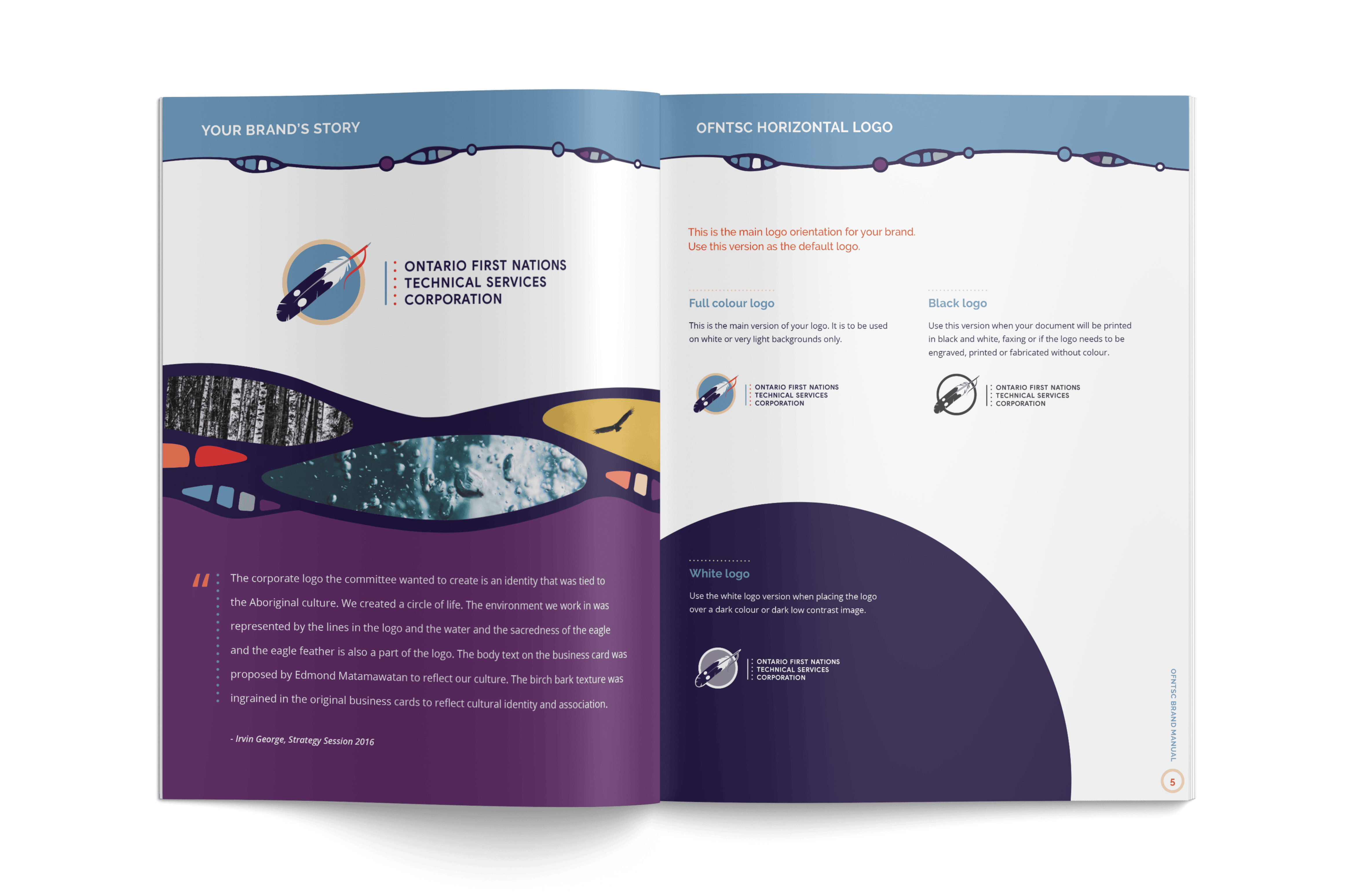
A preview of the inside of the Ontario First Nations Technical Services Corporation Brand manual.
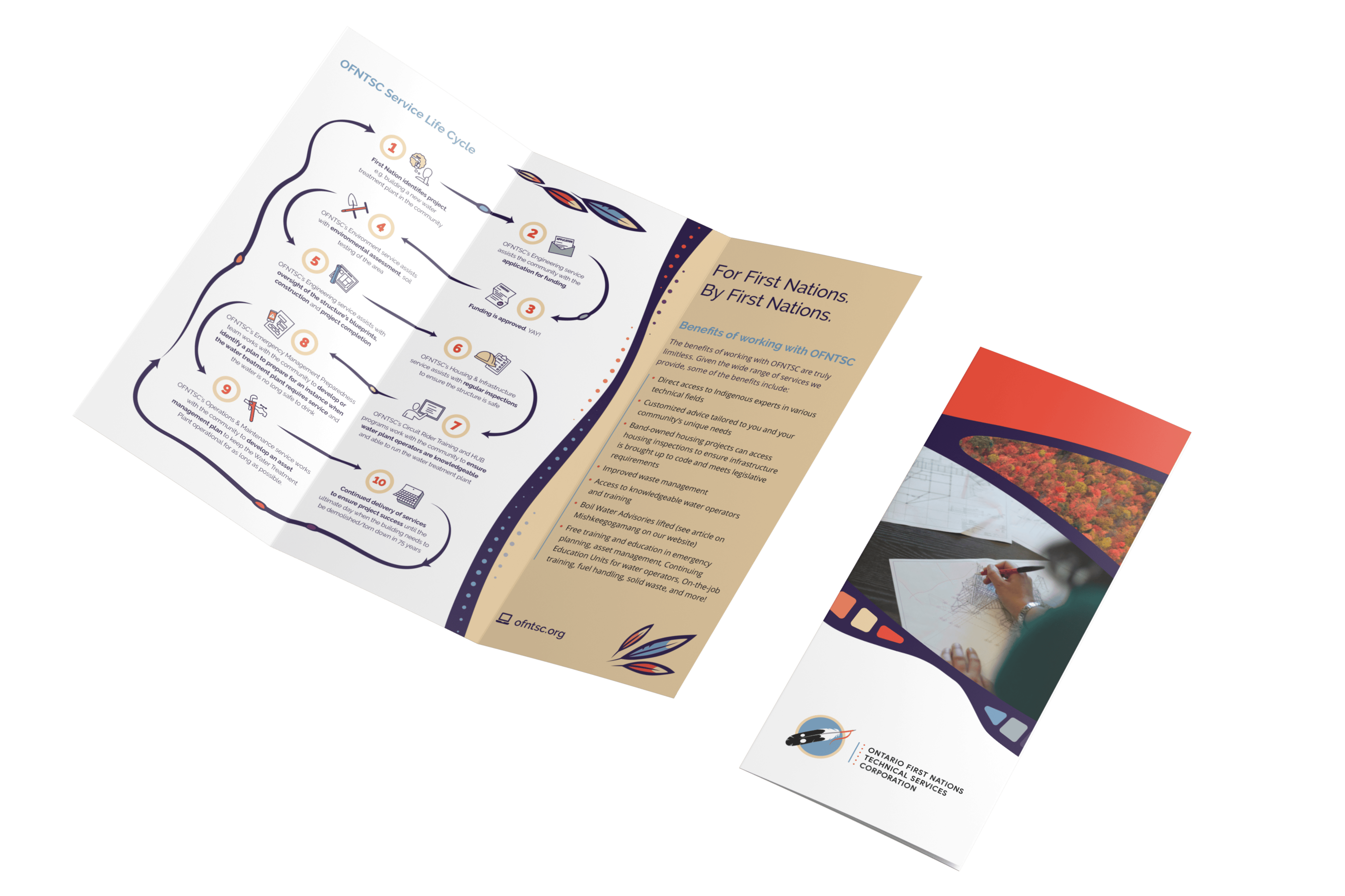
A brochure for First Nations people by the OFNTSC. The brochure features the OFNTSC Service life cycle and shows a flow chart of how the OFNTSC can help.

To help them spread the word about fire safety, we created infographic cards and animated videos with tips for avoiding fires in homes. And we produced these not only in English but in several Indigenous languages too, including Anishinaabemowin, Nêhinawêwin, and Kanien’kéha.
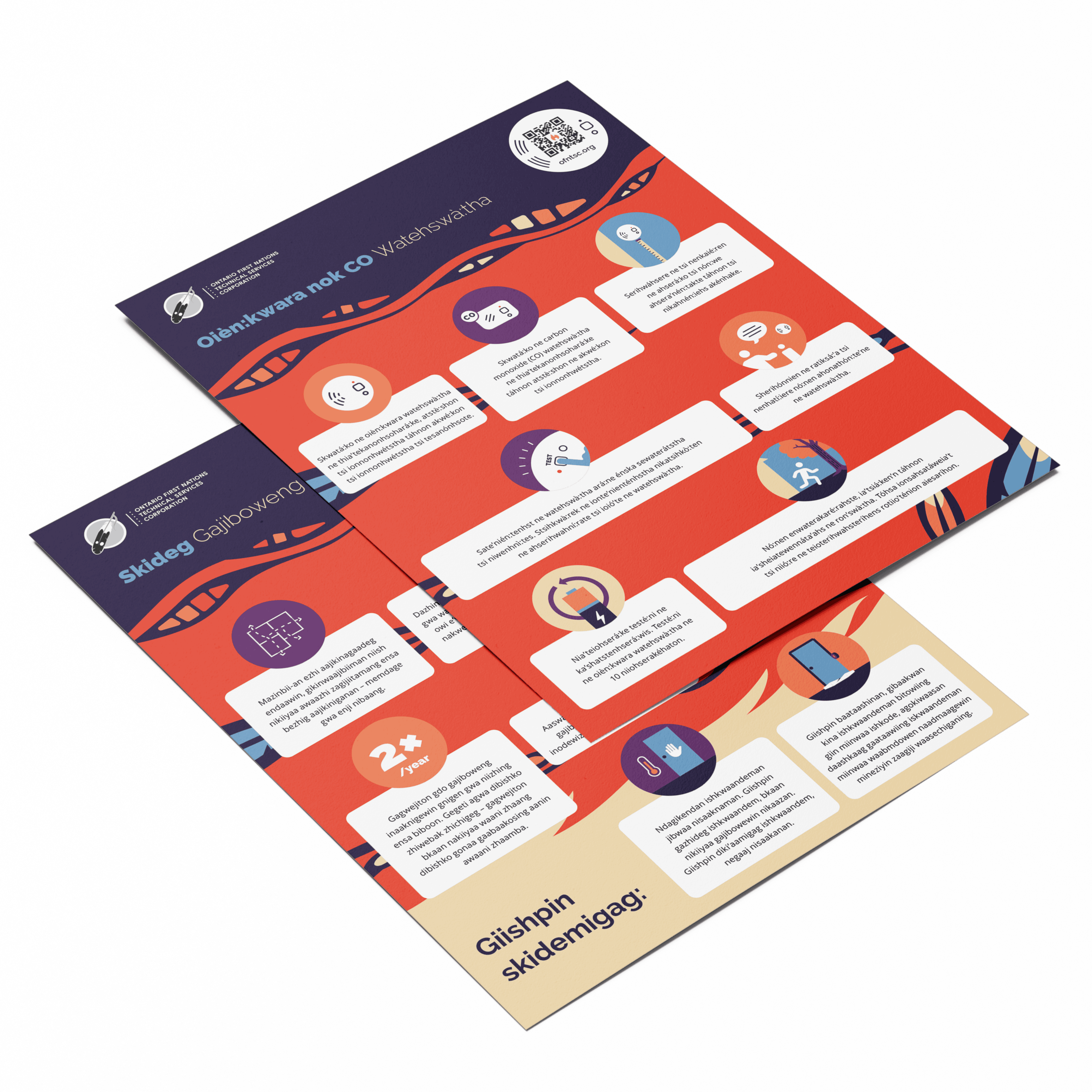
An OFNTSC fact sheet The pages are oriented as if laying on a surface diagonally, pointed towards the viewer.

Making a difference

Our campaign work has helped share important safety messages with a wide audience of First Nations in Ontario, and ensures equitable access for Indigenous language speakers who might otherwise have been left out. Meanwhile, the updated branding and templates have strengthened OFNTSC’s self-reliance, helping them easily create branded assets and keep them consistent across their channels.
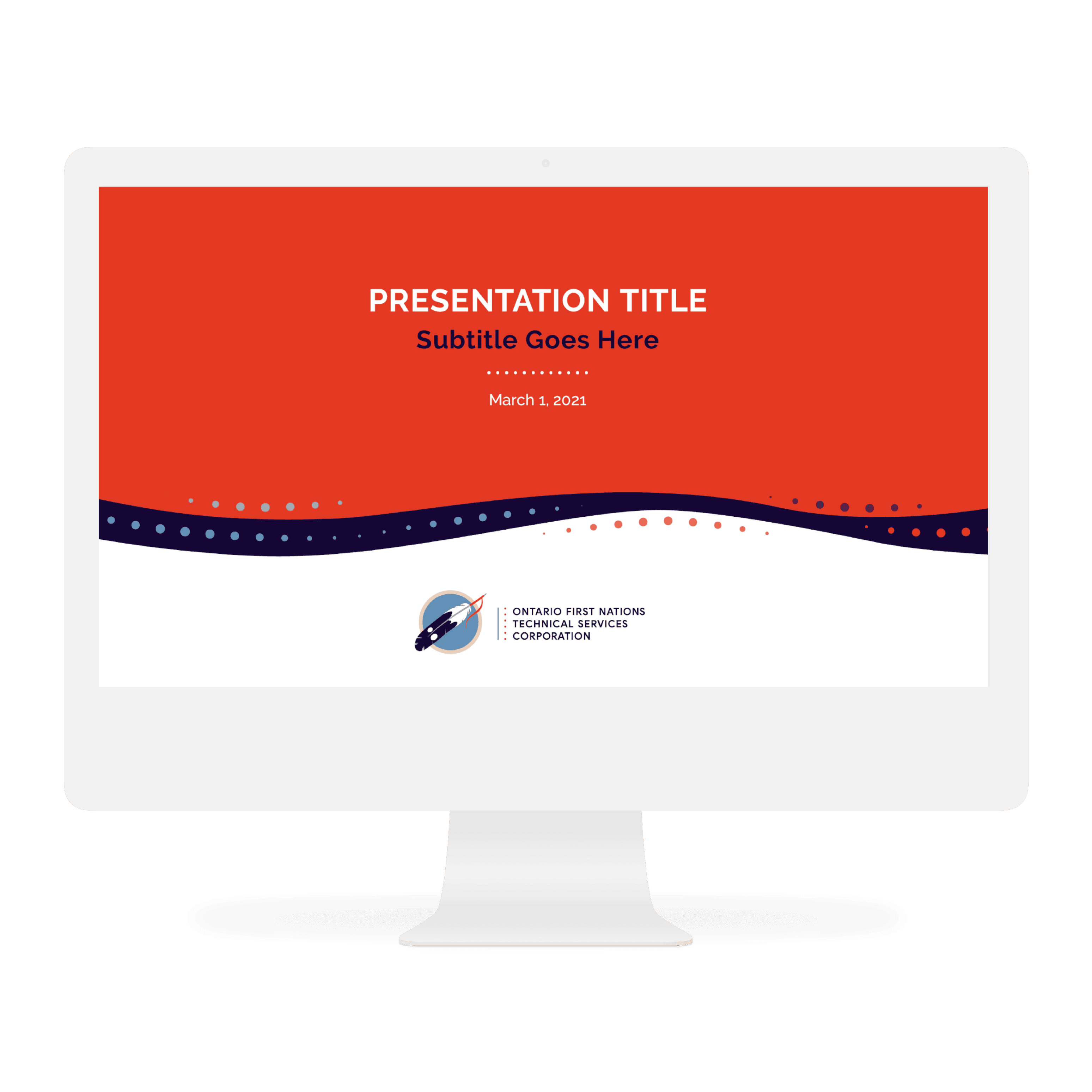

A Mac mockup of a presentation deck. The deck features an orange and white background, with the two colours separated by a wavy black line with colourful dots surrounding it. In the top orange section there is spaces for the presentation title, subtitle, and date, and in the bottom white section the OFNTSC logo is present in the centre.
A mockup of a company truck for OFNTSC. Pictured is the drivers side view of the truck. The truck features the OFNTSC logo on the door, on a white background. The back of the truck is orange, in a diagonal reaching to the bottom of the back door. Separating the two sections is one curved line, and two pointed ovals featuring colour blocks of yellow, orange, red, and deep purple in one, and deep purple and blue in the other, separated into sections by black lines.
An icon in a service series. The icon features a person with a thought bubble above their head. In the thought bubble is a tap with water pouring out of it into a clear glass.
An icon in a service series. The icon features an application letter rising out of an envelope.
An icon in a service series. The icon features blueprints of a home. One of the blueprints is rolled up and coloured blue, and the spread out page behind it features the blueprints themselves on a white piece of paper.
An icon in a service series. The icon features a pipe with a handle to turn the water on and off. Layered on top of this pipe is a wrench with a red handle.
A person stands in front of a purple background with a bright orange shirt. On the shirt is the OFNTSC logo.

The team at Design de Plume created a beautiful brand guide and graphic elements that we now use daily. Their team is professional, courteous, efficient, and easy to work with. Highly recommended!

Chelsey Johnson, OFNTSC Communications Manager