CLIENT
Canadian Broadcasting Corporation (CBC)
SERVICES
Illustration
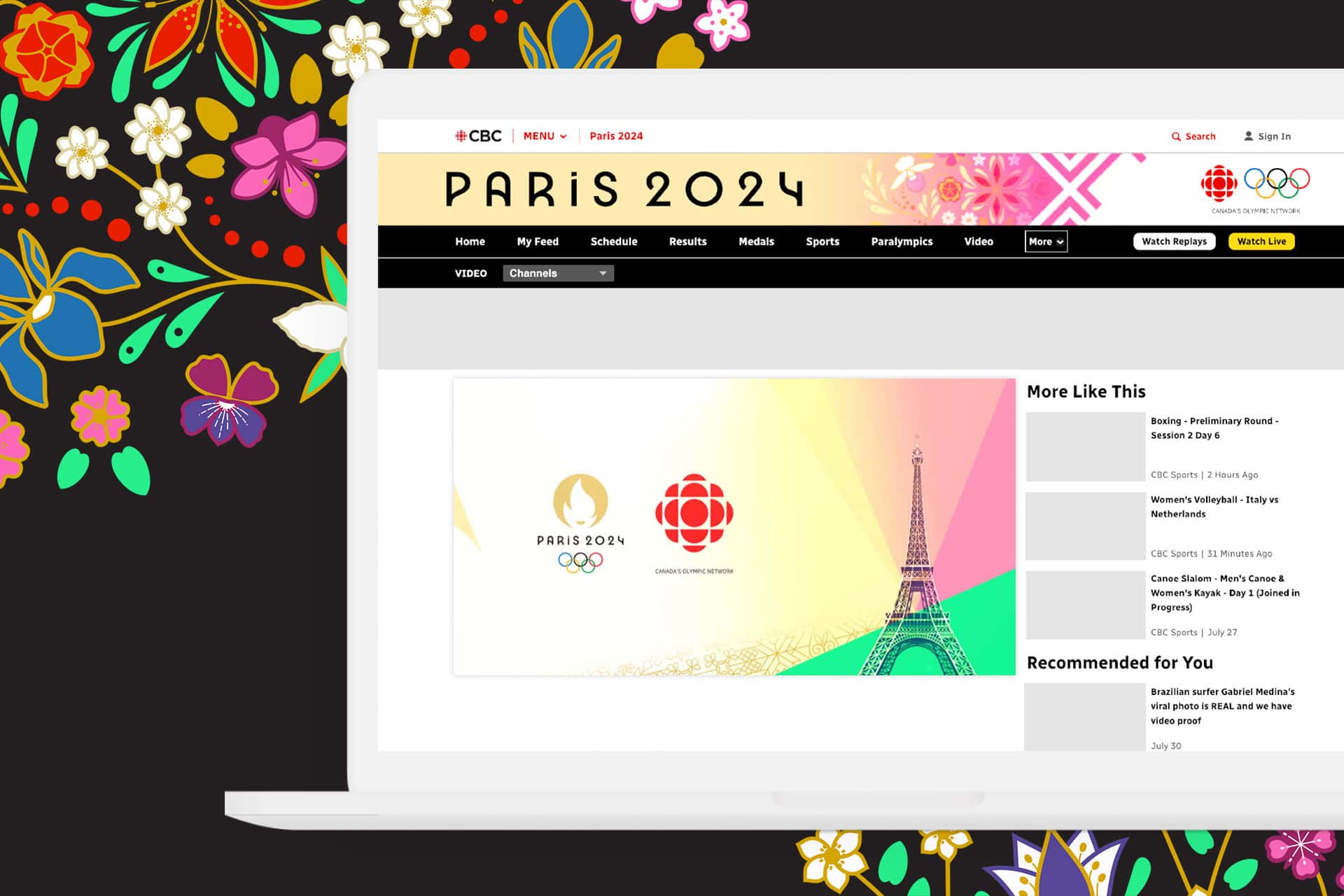
As an Indigenous-owned and women-led company, we were honoured to create the Indigenous patterns featured in CBC’s Olympic campaign materials.
For these designs, two of Design de Plume’s Indigenous designers, Jennica Robinson, and Lauren Polchies, drew inspiration and symbolism from their diverse backgrounds.
Jennica, an Anishinaabe Kwe and proud member of Aundeck Omni Kaning First Nation on Manitoulin Island, serves as the Design Lead at Design de Plume. Driven by a passionate commitment to amplifying unheard voices, Jennica’s artistic journey is a celebration of cultural narratives. Through her creations, she strives to raise awareness among those who may not be looking in the right direction or listening to the right voices.
Lauren, a Wolastoqiyik (Maliseet) member of Woodstock First Nation, is a Graphic Designer at Design de Plume and at the Canadian Crafts Federation. Passionate about cultural preservation and innovation, Lauren strives to incorporate traditional Indigenous views into her work, bringing timeless ideals and designs into the modern world.


How we helped
At Design de Plume, our creative process is deeply rooted in the rich traditions and cultural heritage of our Indigenous designers. The patterns created by Lauren Polchies and Jennica Robinson for the CBC Olympics reflect a harmonious blend of traditional Indigenous art styles and modern aesthetics. By drawing from their distinct backgrounds, they have crafted designs that embody the essence of their heritage while resonating with contemporary design elements. Below, we explore the meaning and inspiration behind each pattern, highlighting the unique cultural symbols and stories that guided their creation.

The pattern created for the CBC Olympics draws inspiration from my Anishinaabe heritage. I come from Aundeck Omni Kaning First Nation on Manitoulin Island, Ontario, and this design reflects the art styles commonly found in my community and the surrounding areas. The overall style incorporates elements from the organic and bold Anishinaabe painting styles, which are then complemented by the intricate and detailed characteristics of Art Deco. The pattern includes floral motifs that represent the twelve flower emblems of Canada’s Provinces and Territories. These flowers are interconnected and arranged using curving stems. In Anishinaabe art styles, linework is often used to symbolize communication, connection, and the inner spirit. By combining these different styles, the pattern achieves a cohesive look that harmonizes with the illustrative Art Deco programming design.
Jennica Robinson, Design Lead at Design de Plume (Pronouns: She/Her/Kwe)

The geometric pattern was designed to represent my Wabanki heritage. The Wabanaki Confederacy contains multiple First Nation groups; the Wolastoqey, the Mi’kmaq, the Passamaquoddy, and the Penobscot. There is a lot of overlap in culture and art style between these four groups. I chose to represent the Wabanki as a whole, as opposed to just my Wolatsoqey heritage, so a larger group of people could see themselves represented in these designs. The designs themselves are based on geometric patterns found in beadwork, basketry, and quillwork. They were slightly updated to represent a modern, art-deco style, which is also very geometric. The art deco style was created in France in the 1910’s. These two styles are tied together to represent the concept of Etuaptmumk (Two-Eyed Seeing). This concept of Two-Eyed Seeing was originally introduced by Mi’kmaq elders, it means “to view the world through both Western and Indigenous knowledges and worldviews and learning to use both these eyes together, for the benefit of all.
Lauren Polchies Graphic Designer at Design de Plume (Pronouns: She/Her/Nekəm)
