CLIENT
Maamwesying Ontario Health Team
SERVICES
Branding
Web design
Development
Communication Material
The Maamwesying Ontario Health Team (MOHT) is the only Indigenous-specific health team in Ontario.
Maamwesying means “the act of working as one” in Ojibway, reflecting the organization’s commitment to unity and collaboration.
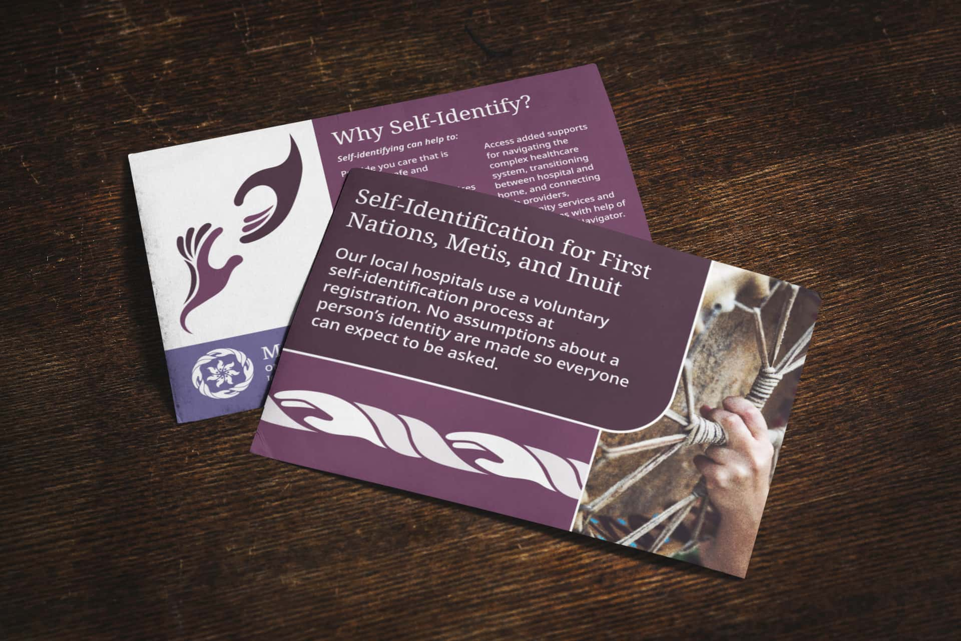
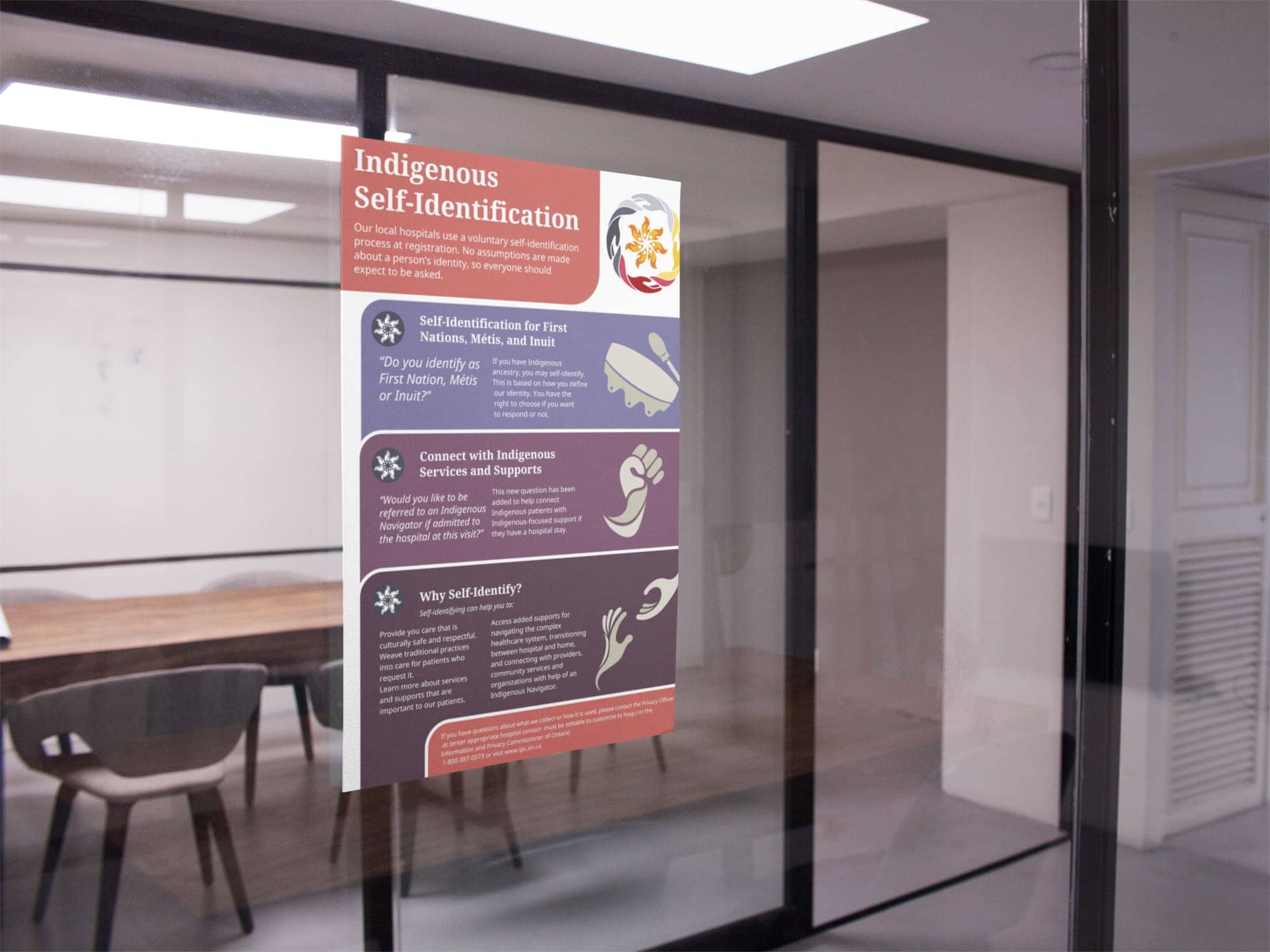
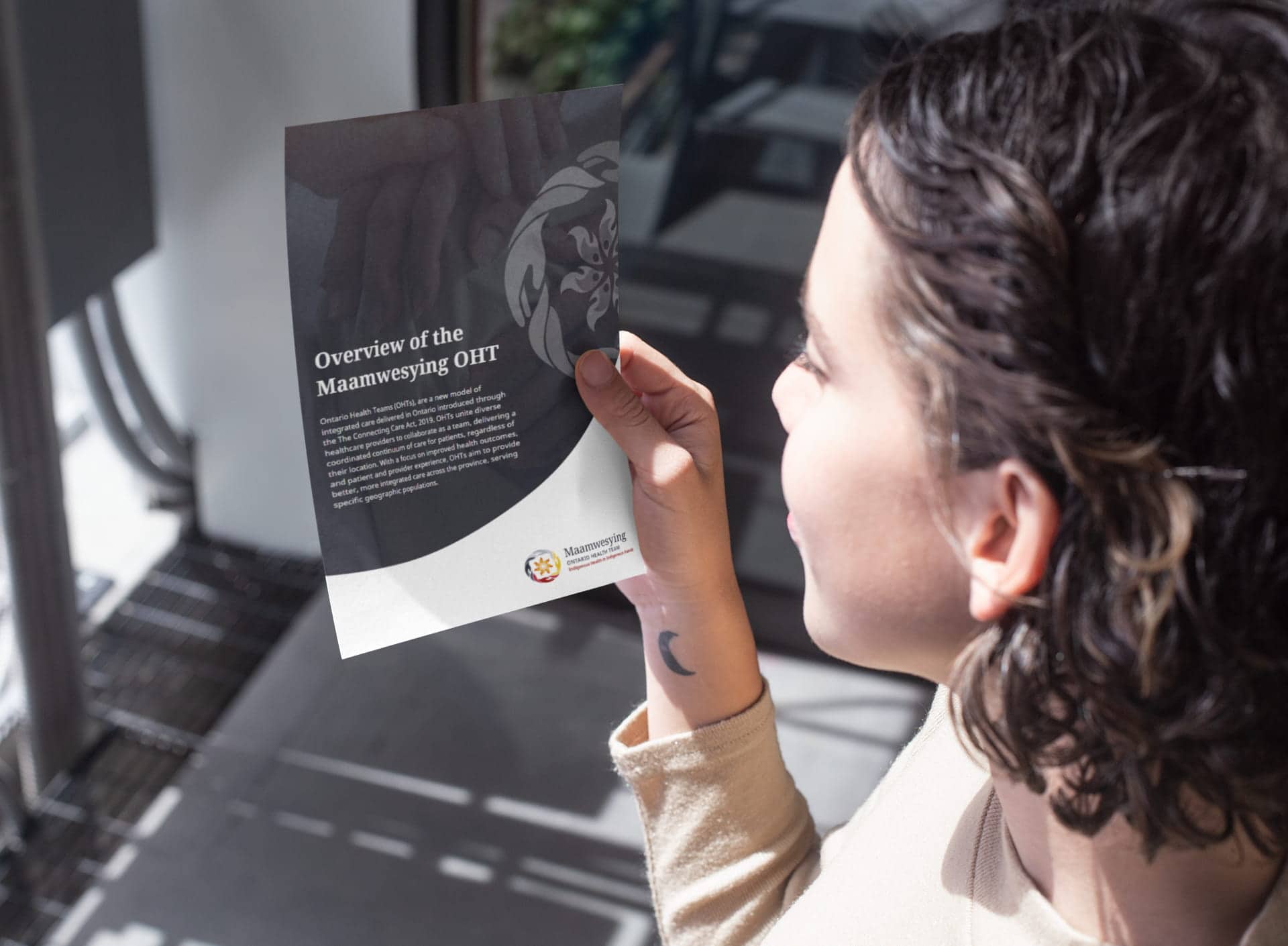
We worked with the MOHT team to create a brand identity that is immediately recognizable and reflects their mandate to provide culturally sensitive, compassionate, respectful, and qualified healthcare to Northern Ontario communities.




How we helped
MOHT’s work has always been deeply connected to the community, and this branding initiative was a chance to celebrate that legacy. We created a new logo that serves as a visual representation of their tagline, “Indigenous Health in Indigenous Hands.” It features four hands braided together to represent the collaborative efforts between the MOHT and local communities. At the heart of the logo is a flame-like flower with seven petals to represent the Seven Grandfather Teachings, sacred fire, and the gathering of communities.

Making a difference
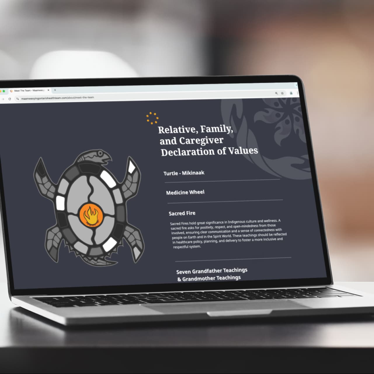
The new brand serves as a bridge between MOHT’s history and its future. The strong and clear identity helps establish trust and recognition across all audiences. The branding honours the organization’s Indigenous roots and community-focused mission while communicating MOHT’s forward-thinking vision and values.
