CLIENT
Indigenous Tourism Ontario
SERVICES
Branding
Illustration
Web Design
Digital Assets
For Indigenous communities, tourism can foster a thriving economy and help preserve culture.
Indigenous Tourism Ontario is the only organization in the province fully dedicated to advancing Indigenous tourism, providing training programs, marketing, funding support, and more. After half a decade of growth, they were seeking a comprehensive brand identity to better align with the scale and scope of their work.
How we helped
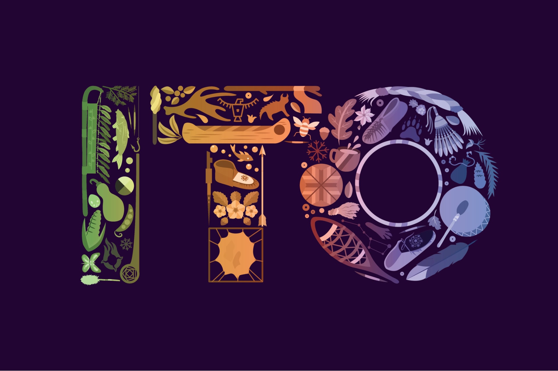
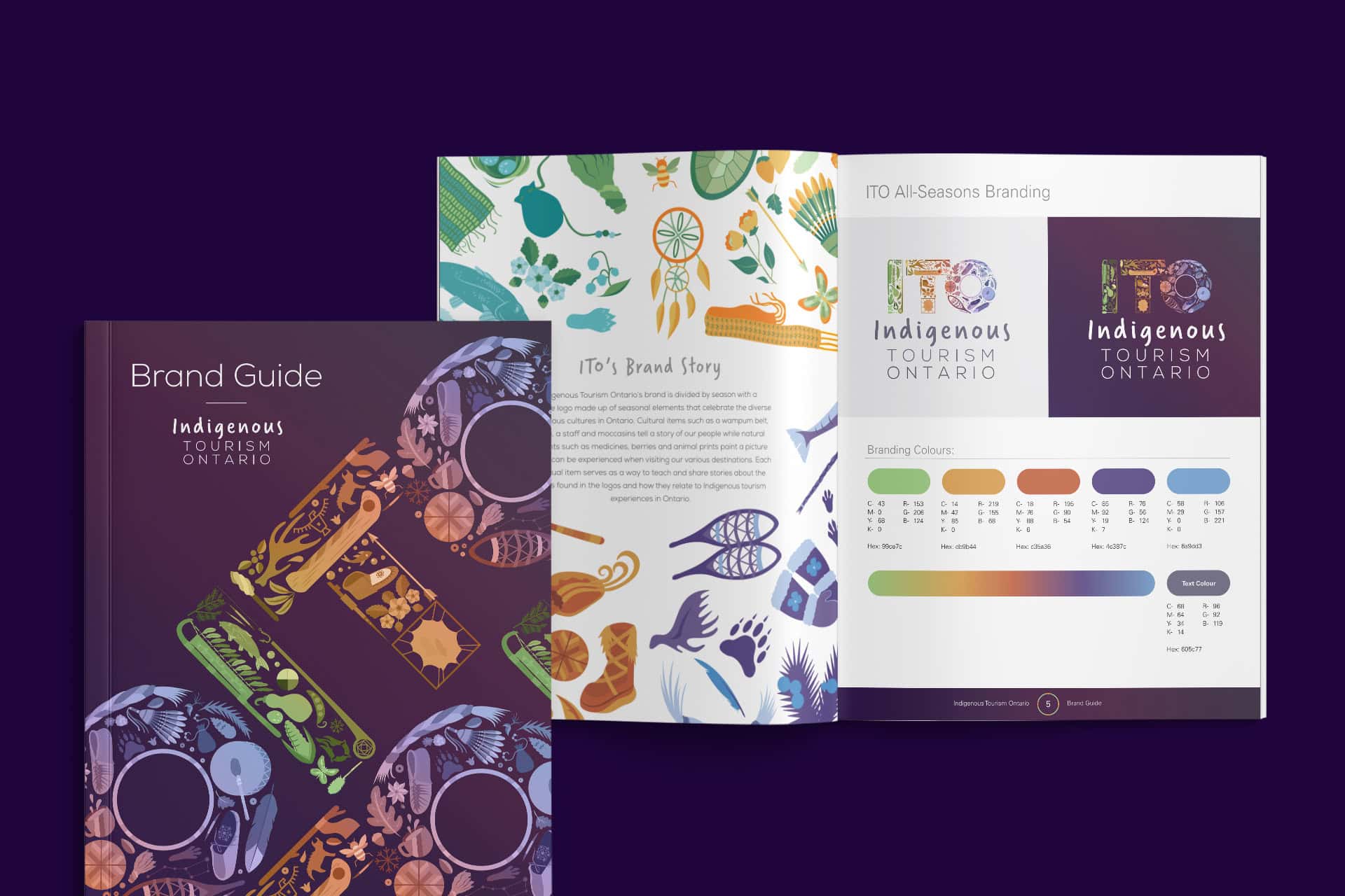
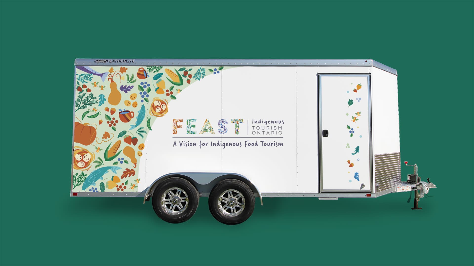
With over 700 ITO members across the region, it was important to showcase the range of cultures and activities that visitors can experience. We captured that diversity with a huge library of colourful illustrations, assembling them into a flexible brand system that changes with the seasons.




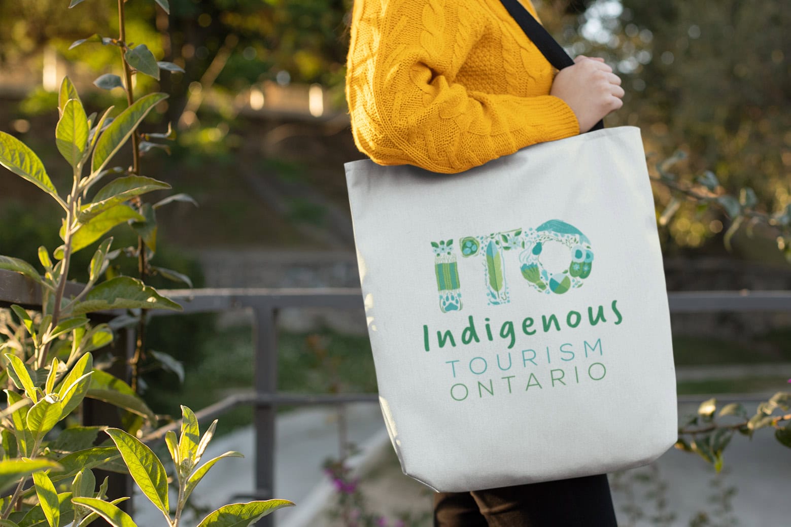
Each element tells a story: cultural symbols like a wampum belt, pipe, and staff paint a picture of our people, while natural elements such as medicines, berries, and animal prints give a taste of what visitors can experience here.
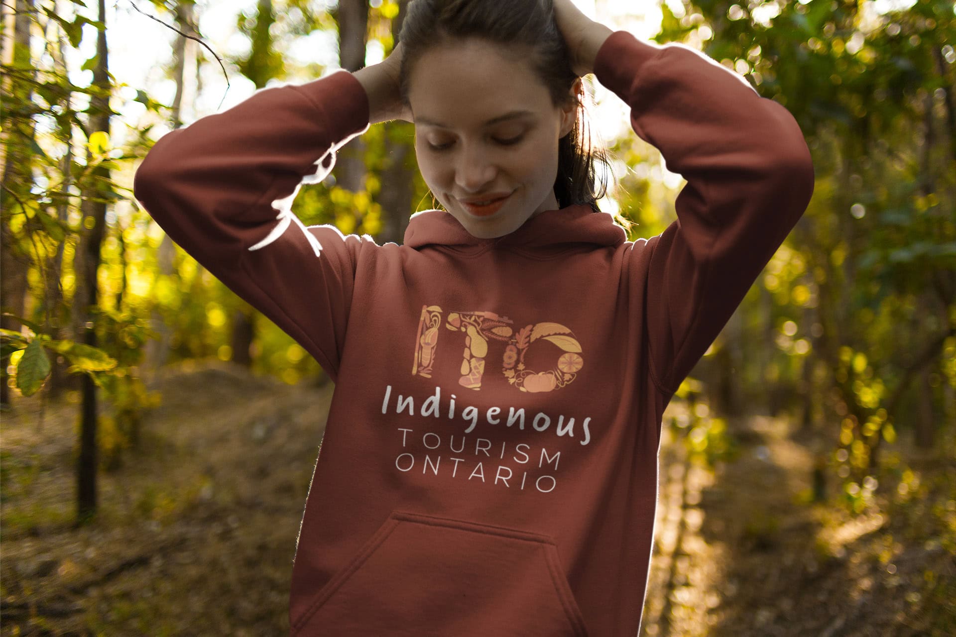
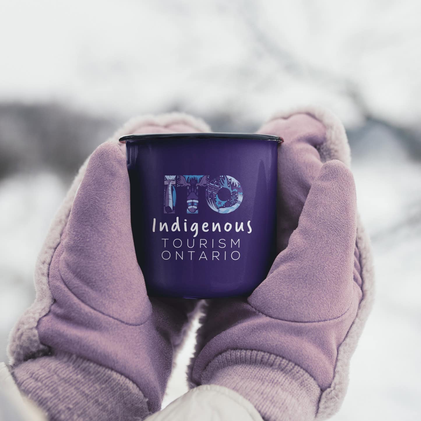
In addition to the main brand, we created a family of four seasonal logos and colour palettes. These can effortlessly swap places at the start of each new travel season, keeping things fresh while maintaining consistency and brand recognition.
Making a difference
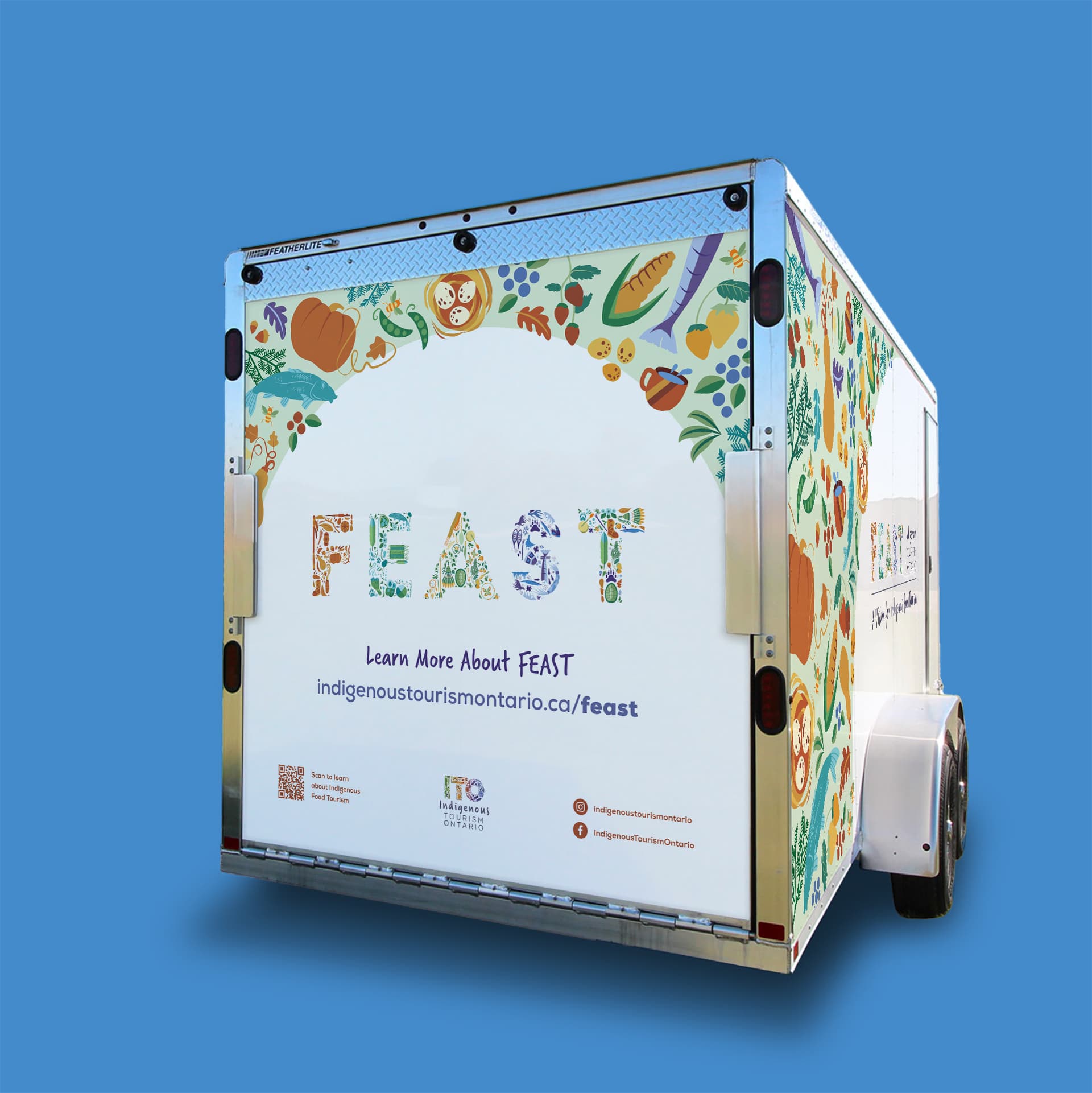
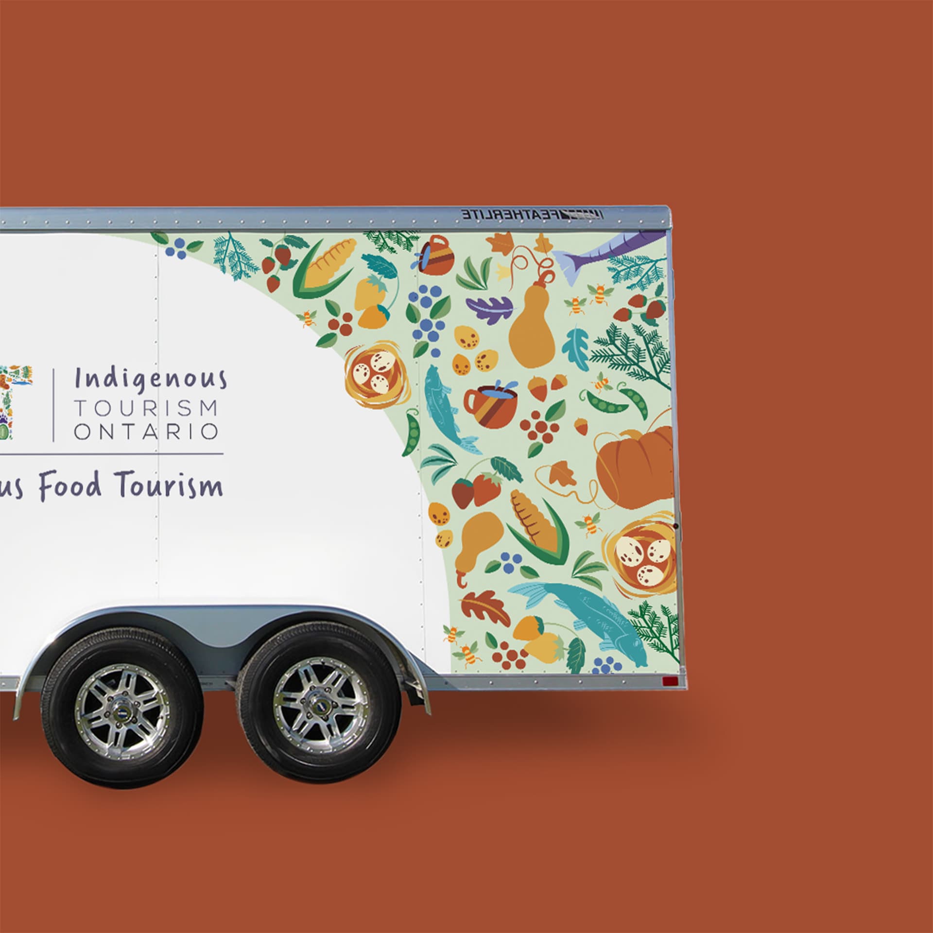
The new identity gives tourists a warm welcome, each symbol inviting curiosity and conversation about the stories behind it. And interchangeable seasonal branding makes it easy for ITO to boost audience engagement across their channels, from their website to their merchandise. Unsurprisingly, ITO loved it—and it even netted us a WOLDA award in the flexible branding category.

When I just opened it and saw the logo, I gasped… it’s gorgeous!
Leni Brem, ITO Director of Operations
